Estimated Reading Time: 4 minutes
Knowing what business card details to add and what to leave out helps create a card that’s both eye-catching and well balanced. When designed correctly, your business card will remind people of the first time you met and encourage those who are interested in your products or services to get back in touch or visit your website for more information.
A business card is a tried-and-tested marketing tool, whether you’re starting a side hustle or expanding your brick-and-mortar business. It’s often the first interaction a customer has with your brand, so beyond reflecting your business in a positive way, it should contain pertinent information. That’s why the first question that comes to mind is ‘what goes on a business card’ when considering creating one.
Here, we’ll cover everything you need to know about what to put on a business card.
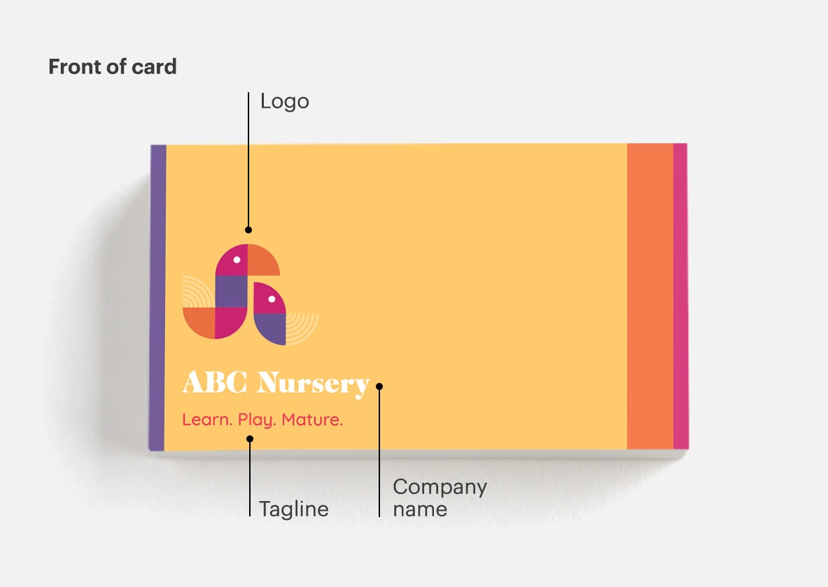
- Logo
- Company name
- Tagline
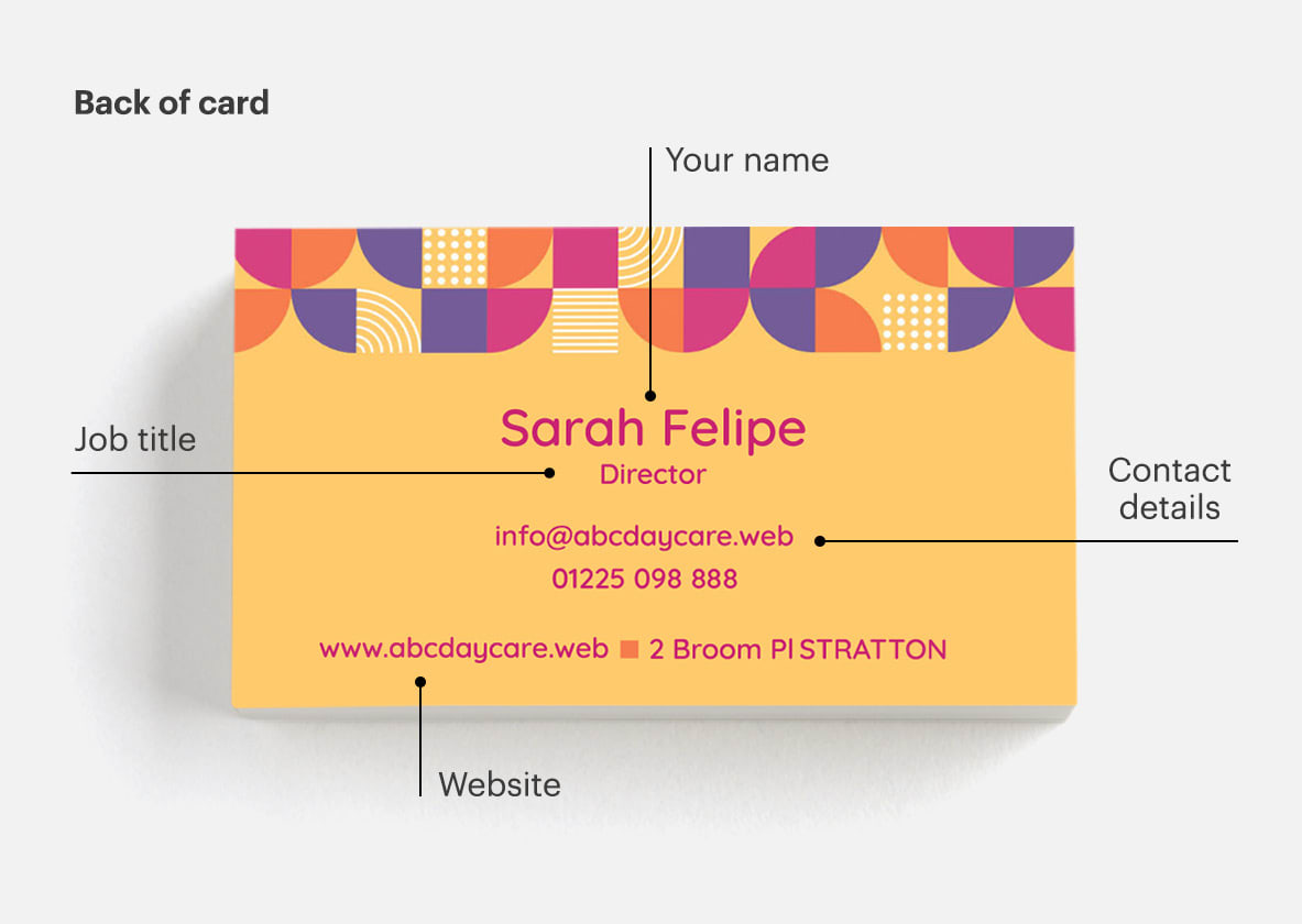
- Your name & title
- Contact details
- Your address — online or physical
- Social media handles
- A QR code

1. Logo
Your logo is a visual representation of what your company does and what you stand for. It should epitomise your business and be a symbol for your customers to remember you by. When you have a logo, it makes your company feel like it’s credible, professional and trustworthy.
Your logo should be displayed proudly on the front of your business card. Use a high-quality image at 300 dpi (dots per inch) to make sure the edges appear crisp when printed. Try not to add text too close to the logo or scale it too big, and remember to let it breathe with a little white space. If your logo looks cramped on your business card design, scale it down a bit and increase the white space around it.
2. Company name
While your logo is the key component of your brand identity, you should include your company name on your business cards, too. And give it plenty of space — your name is what people are most likely to remember, so it’s a critical business card detail. Generally speaking, the name of your business should be the largest piece of text on your card. You should make sure to spell out the full name of your business so people know what your business is all about right away. Think: Luna Salon instead of just Luna, or Complete Financial Solutions instead of CFS.
3. Tagline
Do you have a tagline or slogan for your small business? Include it on your business card! If you don’t have an official tagline, create one by summarising what you offer in a few words — this can be especially helpful if your name isn’t particularly self-explanatory. For example, Stratton Design uses the tagline ‘Website design & hosting’ on their business cards to clearly communicate what they specialise in. These few words are professional, honest and focus on their core service.

4. Your name & title
Create a personal connection to your business by adding your full name to your business card, along with your job title. Including your title serves as a great memory jogger, since not everyone’s good with names and some people are more likely to remember you for your area of expertise, it’s crucial business card information to include. You can also add a headshot if it feels relevant to your industry — a photo is a great way to show the person behind the business, especially if you work in a client-facing position. Photo business cards are ideal for professionals like estate agents and photographers.
5. Contact details
The contact information on your business card should include your email address and phone number, these are key details for a business card and how most people will contact you. On your card, align your contact details to the left, right or centre and choose a font that’s easy to read — and if you prefer one of these communication methods to the other, emphasise it with a larger size or prominent placement.
6. Your address — online or physical
Make sure to include your website URL — you can drop the http://, as it’s not necessary and takes up space. Remember, it’s important that there’s consistency between the design of your business card and your website. When a potential customer visits your website after seeing the URL on your business card, the experience should be cohesive all the way from your font choice to your colour scheme. If you operate out of a brick-and-mortar location, adding your address is vital to increasing foot traffic. Operate your business completely virtually? You don’t need to include a postal address if you’re not expecting any foot traffic — leave it out to save space.
VistaPrint Tip
Megan Morahan, a creative director at VistaPrint, says that when it comes to adding text to your business card, less is more. “It should be easily digestible for whoever is receiving it. The less info you put on there, the better.”
7. Social media handles
If you’re active on social media, include your social handles along with recognisable social media icons on your business card. Whether you’re an avid user of TikTok or prefer Instagram, this is a great way to tell customers where they can find you and attract new followers.
8. A QR code
Running out of space on your business card? Consider adding a QR code so customers can quickly find additional information about your operating hours, special offers or your small business story. This is something that can go on the back of your business card, since it’s extra information.
Practical print information
Ready to print your new business cards? Keep this info in mind.
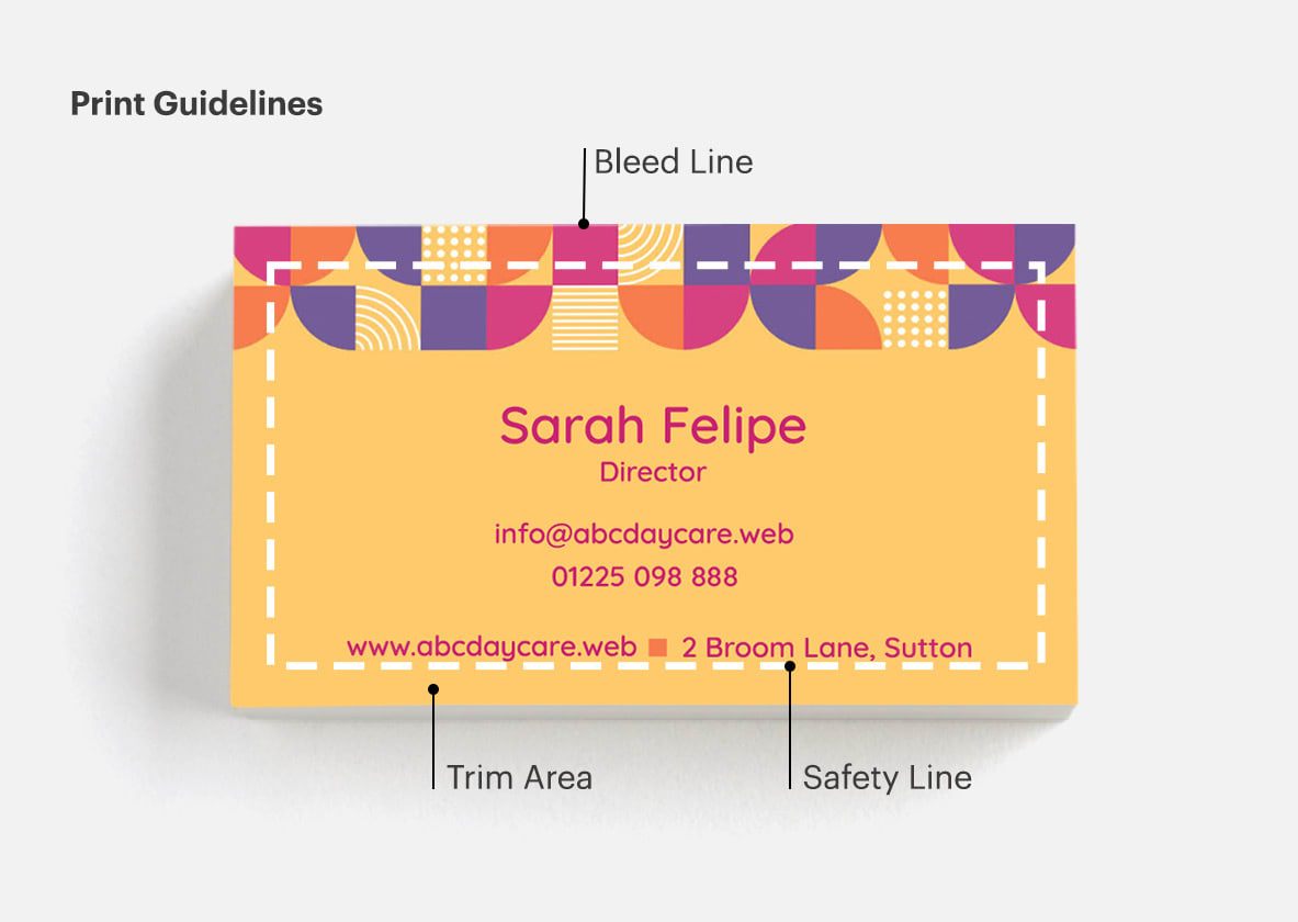
Bleed line. The very edges of the document are called the bleed lines. To prevent an unwanted white border from showing at the edge of your document, be sure to extend any background colours or design elements all the way to the edge.
Safety line. The safety lines are borders that are inside the area where the cut will take place. Keep all necessary information, like names, addresses, phone numbers or logos within the safety line to ensure that they aren’t cut off.
Trim area. Because of the mechanical tolerances involved in printing, the actual cut can happen anywhere between the bleed line and the safety line. That’s why it’s important to keep your text and important images within the safety line and out of the trim area.

To ensure your card clearly communicates everything you want it to, ask someone to look at it before you commit to printing.
You could ask them the following:
- What’s the first thing you see?
- Is it clear what products/services I offer?
- How would you contact me?
- Is the text easy to read?
- Do the logo and text have enough contrast against the background?
If they answer “Yes!” to everything, you’re ready to print.
VistaPrint Tip
Want to let a professional tackle your business card design? Once you find a template you love, work with an expert from Vista’s Design Services team to get a completely custom look.