Estimated reading time: 6 minutes

We chatted with Tristan Le Breton, Creative Director at 99designs by Vista, for tips on how to create T-shirts that have an impact. Whether for your business or a celebration with friends, read on for Tristan’s design advice.
We can’t be the only ones who have one too many branded T-shirts in our wardrobe. There’s just something about a cool T-shirt design, whether from a favourite restaurant or themed hen do, that’s irresistible. And luckily for you, designing a stand-out tee is easier than you think.
Whether you want to design souvenir tees for a family holiday, create a custom gift for a loved one or make logo T-shirts for your small business, follow these steps to create one-of-a-kind apparel.
How to design T-shirts:
- Define your design.
- Think about content, size and position.
- Create the right vibe.
- Pick the perfect font.
- Position content with care.
- Size your art for impact.
- Make colours work for you.
- Pick a style.
- Double-check your design.
1. Define your design.
There’s no such thing as an all-purpose design…so ask yourself, what’s your reason for designing a T-shirt? Will it be merchandise you sell at your shop or freebies for an upcoming event? A T-shirt you’d love to sell at a craft show will probably look different to the ones your employees wear behind the scenes.
And once you know your purpose, it’s easier to imagine who’s going to be wearing your new T-shirt design. Is this an all-ages product? Adults only? Is the demographic even more specific (say, teens or millennials)? Do you need women’s, men’s or unisex tees? Will there be a broad public market for the T-shirts, or is it just for a select group of people? Answering these questions helps you consider the look you’re going for and how adaptable it needs to be to accommodate a variety of sizes or styles.
A practical approach is to think of the ideal person you want to attract with your T-shirt design, then imagine the brands they lean towards and the clothes they like. What would they wear? And, perhaps just as important, what wouldn’t they be caught dead in?
VistaPrint Tip
If you’re making a T-shirt as a gift, consider using embroidery instead of printing for an extra-special touch.
2. Think about content, size and position.
“A T-shirt gives you a lot of real estate to work with”, Tristan says. “Use it as a chance to have some fun with your visual brand or communicate your story… but keep time and context in mind. The beauty of something like a T-shirt is that it can capture a moment in time and form a special bond among the wearers. That said, you want to create a design you’d be happy to see someone sport in, say, five years.”
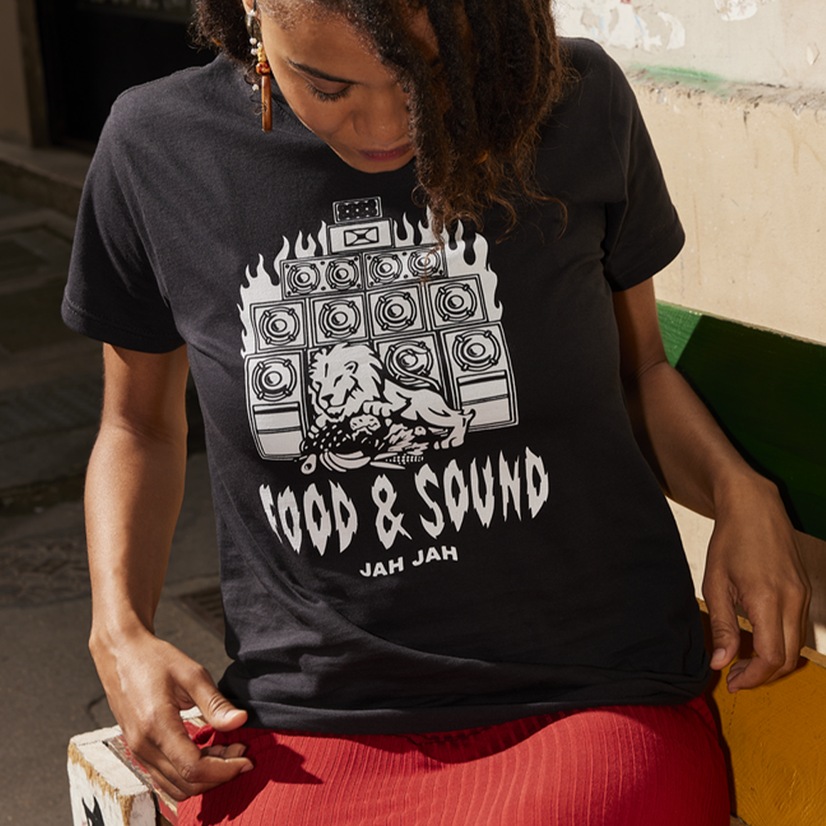
So, when it’s time to choose visual content for your T-shirt, decide if you’re going to use text only, art only or a combination of both. The text serves just about every purpose and can make a strong T-shirt by itself. A photo or graphic image can stand alone, but will also work well with text when used wisely. “If there’s something iconic about your business (or organisation), like a slogan or mascot, then by all means incorporate it into your T-shirt design”, Tristan advises. “Play around with different elements to create something unique.
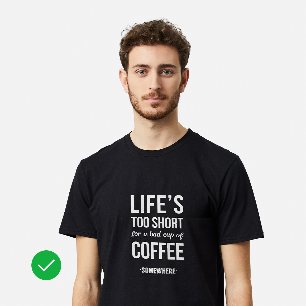
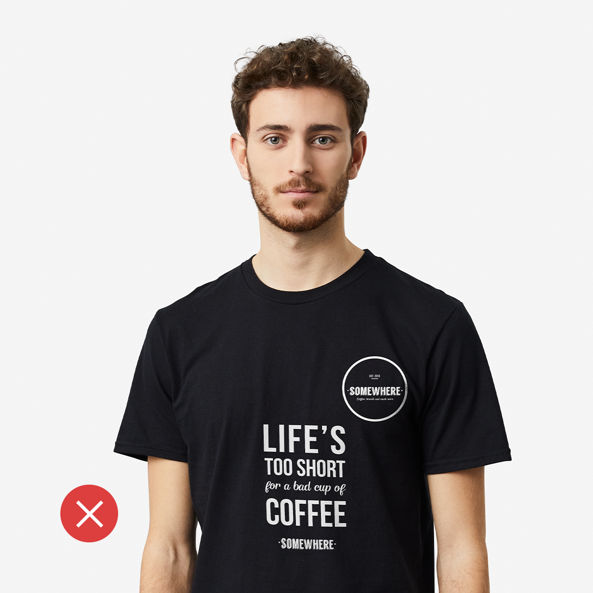
“But don’t add so many elements to your design that the T-shirt becomes ‘noisy’ — too many competing details to be clear. The viewer should quickly appreciate the message of the T-shirt and not have to decipher it.”
3. Create the right vibe.
We’re all about a vibe – but vibe can mean a lot of different things. It’s mostly reflected in the emotional associations a viewer may have with colours, images or words. Does the T-shirt make the wearer look chic or relaxed? Do you want to inspire envy or nostalgia? Whether playful or provocative, luxurious or approachable, minimalist or over-the-top, never forget that the design is an extension of your brand or a reflection of your personality.
Aesthetics play a big part in establishing that vibe. “You want the T-shirt to be both a reflection of your brand and something people will want to wear”, Tristan advises. “The higher quality the aesthetics, the greater the impact.”

4. Pick the perfect font.
This is the fun part. The two main categories of font style are serif (which adds a classic feel and reads well in smaller sizes) and sans serif (which is cleaner and more modern, especially in large format), but your options are pretty much endless from there. The main thing is to make sure your text is easy to read; some handwritten-style script fonts can obscure the message.
“With typefaces, legibility is key — so the main thing to consider when choosing them is the scale of your design”, Tristan adds. “A typeface that works for a full-size back print might not work as a breast pocket and vice versa.
“You’ll notice as you scout out other T-shirts that the best T-shirt lettering designs most often use just one or two fonts. If you stick to one font, make it more interesting by bolding or italicising certain words or by varying text sizes. Or, use two fonts — maybe one serif and one sans serif — to create emphasis and visual variety.”
5. Position content with care.
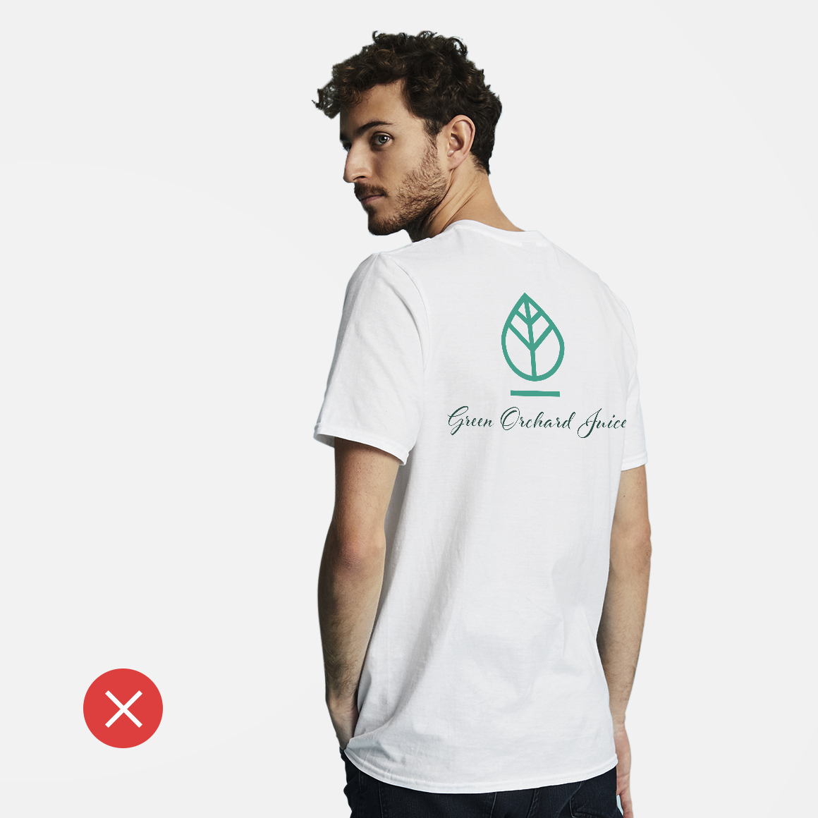
Now it’s time to decide which orientation works best for your blank canvas. Vertical art most naturally aligns with the ‘canvas’ of a T-shirt, while landscape images should allow enough white space (the area not occupied by graphic or text) on either side. How much is enough? Standard T-shirts run from 45 cm across (for a small) to 60 cm across (for an XL). You want to leave 12 cm of white space on either side, meaning your graphic should be 25–35 cm wide at most.
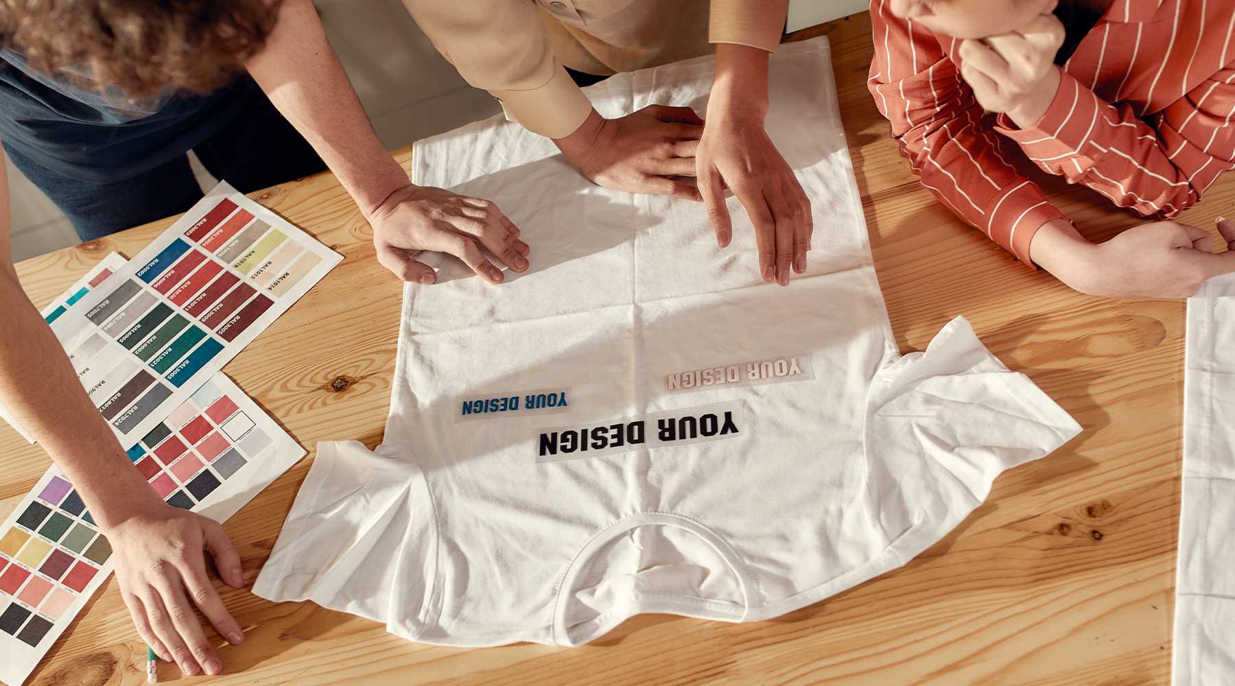
Where your design falls on the T-shirt matters too. The top of your art should rise a few centimetres above the chest and end a few centimetres below. Unless you are creating a full-shirt graphic, you don’t want text and images sagging at the midsection. Uncertain about where your content should sit? Take your photocopied image and move it around on a practice T-shirt. (Making multiple sizes? Do versions for each).
VistaPrint Tip
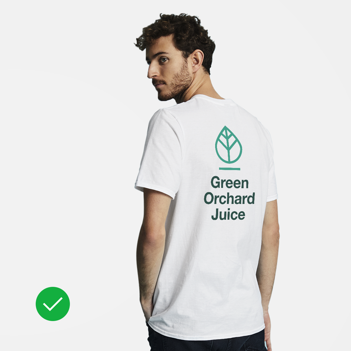
Designing T-shirts for your business? A T-shirt is a great place to show off your logo…but Tristan advises that you shouldn’t just slap it on the front. “Have some fun with your visual brand and communicate your story. The best T-shirts made by businesses feel like works of art rather than something created simply for brand exposure.”
6. Size your art for impact.
For art, many of the same visual rules apply, but you’ll also want to consider how an image scales. Graphics and photo images are both affected by file size, specifically pixel density. Pull something off the web, and it’s likely to be 72 dpi (dots per inch) — too small to translate well when sized-up for printing. Aim for a ratio of at least 200 dpi, or better still 300 dpi. When you’re ready to upload it, save it as a PDF, AI, PSD, JPEG or PNG file type.
If you want to know how a logo or photo illustration will look when expanded to T-shirt size, print the image file out and use a photocopier to blow it up to the equivalent space you want it to occupy.
7. Make colours work for you.
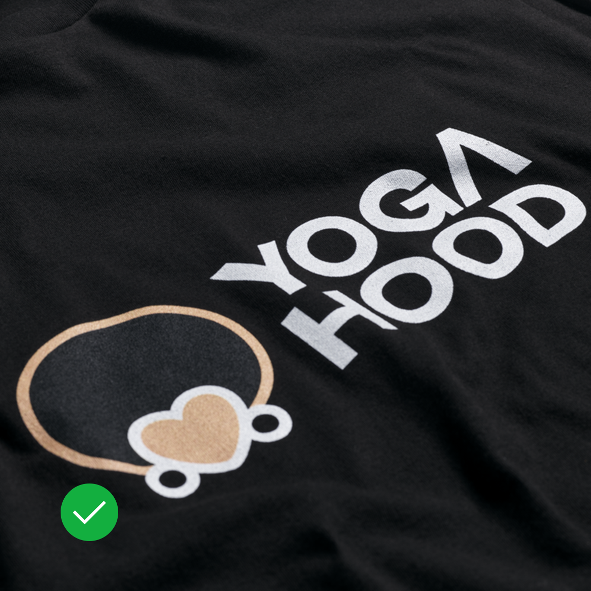
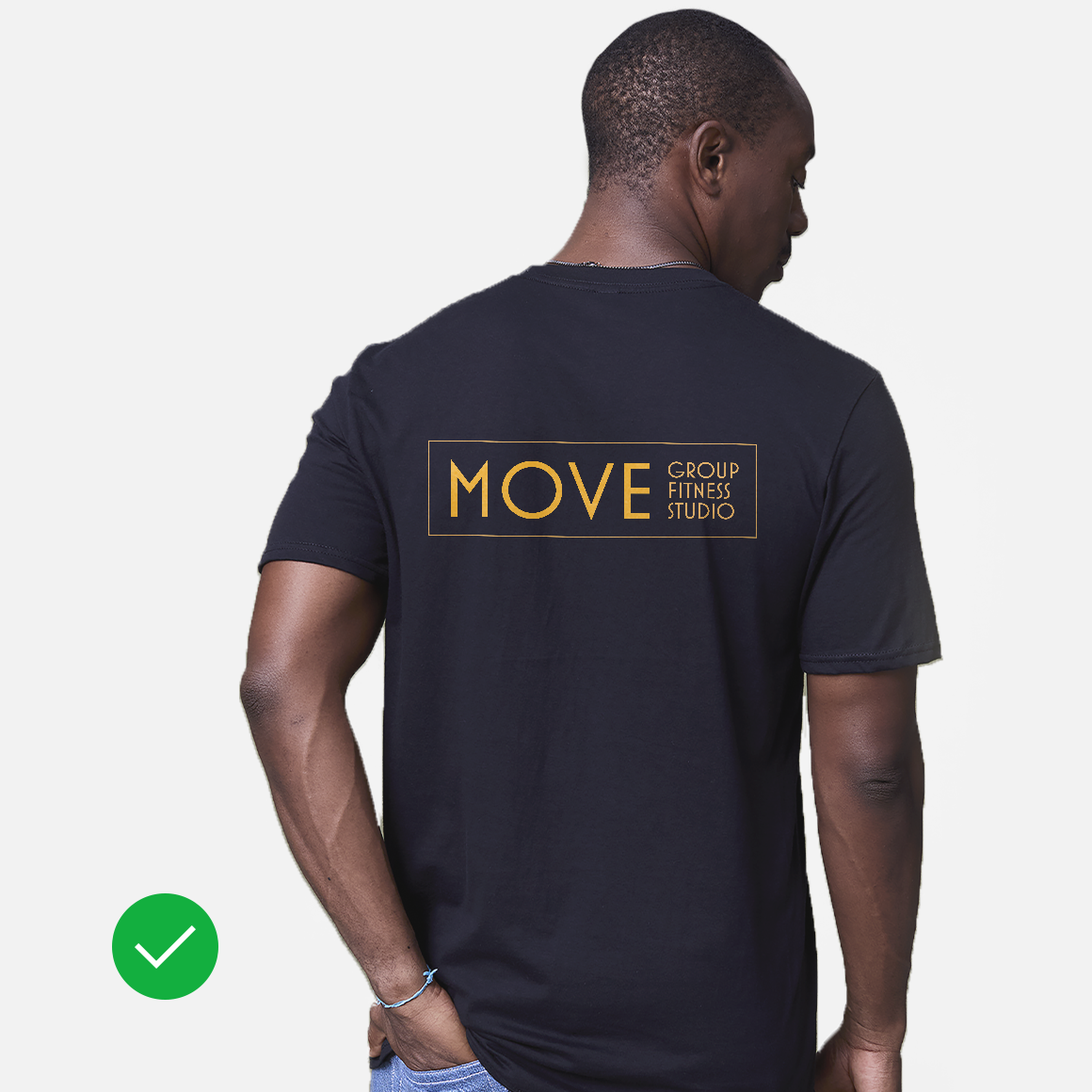
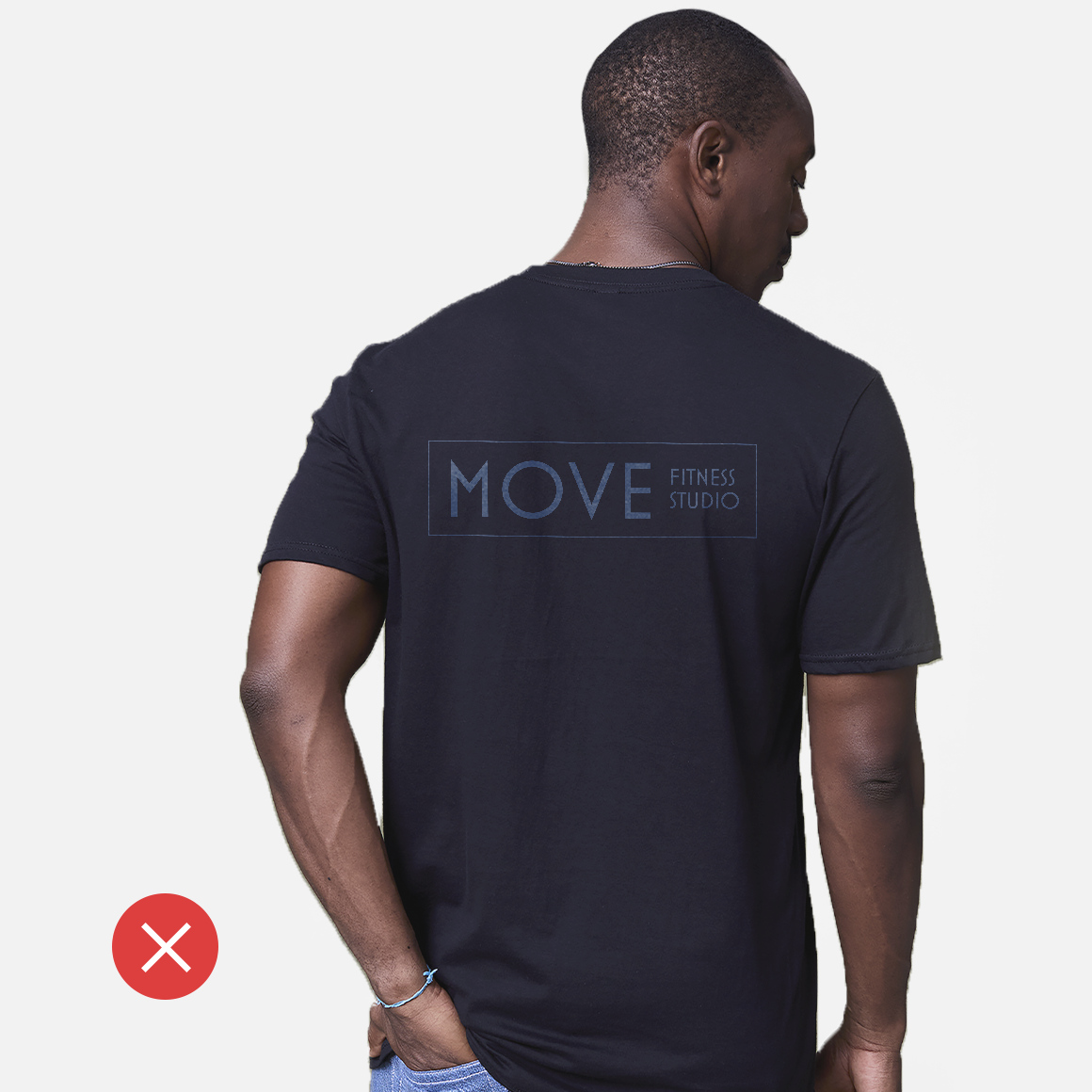
When choosing colours, it’s not all about your favourites — the colours you choose need to be visible on the fabric of your choice. You need colours that feel complementary to each other, meaning that they offer sharp contrast. Naturally, if you want the most contrast, it doesn’t get more striking than white on black (and vice versa). As a general rule, bright colours on a dark background work well for readability… after all, the coolest logo design on earth will disappear if it’s printed in navy on a black tee.
You can also think about colour in terms of the recipient’s preferences. Are you designing a T-shirt for someone who loves bright colours? Don’t be afraid to get creative with a vibrant design. Do you want your coffee shop merchandise to be appealing to all of your customers? Then keep it basic with black, white or grey – the most popular shirt colours purchased with Vista.
8. Pick a style.
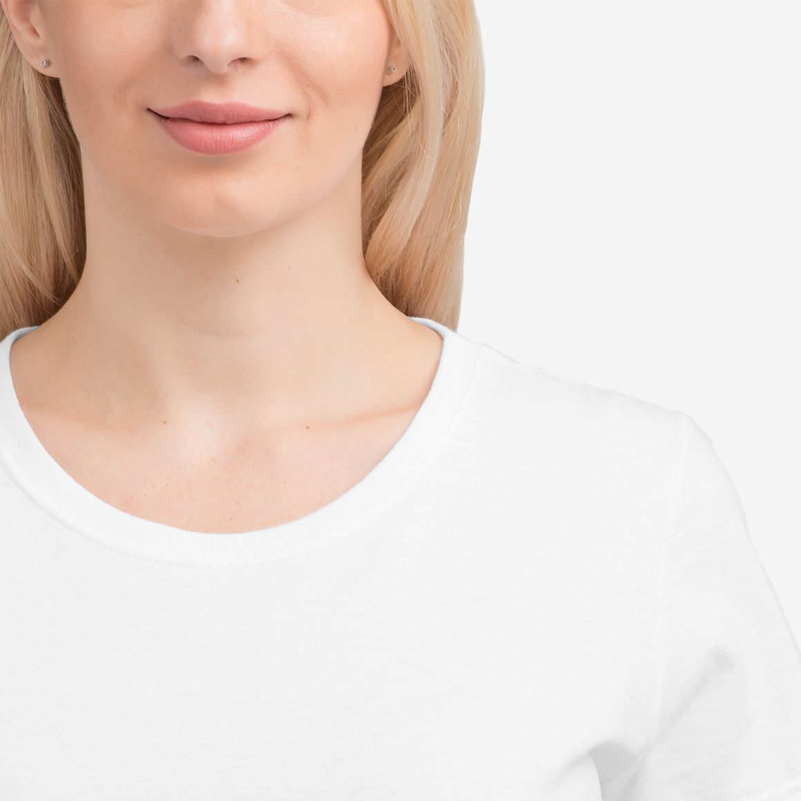
Short or long sleeves? Crew neck or V-neck? Once your design is finalised, it’s time to narrow down the style of T-shirt you want to order. If you’re purchasing shirts as staff uniforms, keep them consistent with a unified style. If you’re ordering a shirt for a loved one, think about what style they’d prefer. A long-sleeve tee is a great cold-weather gift, while a V-neck might be more in line with someone’s personal style.

VistaPrint Tip
Let’s talk fabrics. The most common T-shirt material is cotton, but you can also choose polyester or a polyblend. If you’re looking for something moisture-wicking and wrinkle-resistant, go for polyester. If you want a standard tee, your best bet is classic cotton.
9. Double-check file format, size and colours before printing.
Once you like what you see, it’s time to print. If you’re planning on ordering a big batch of T-shirts, it might be worth ordering just one to make sure you’re happy with your design. Look it over when it arrives and make adjustments, if necessary — maybe the T-shirt lettering needs to be a little bigger, or perhaps you want to reposition some of the content.
Designing T-shirts doesn’t have to be hard. If you know what you want the T-shirt to accomplish, simply factoring in these practical concerns will be enough to translate the stuff of your imagination into wearable reality. And just wait till you see your design ‘in the wild’ for the first time! Behind the counter at that new café, in the front row of a sold-out concert, in photos of that celebration with friends — wherever you see your handiwork, you’ll have the satisfaction of knowing you made that.