Estimated reading time: 6 minutes
What does it take to make VistaPrint’s annual Christmas card collection? Over nine months of work, 50 people (including researchers, strategists, trend specialists, designers, art directors and illustrators), thousands of customer samples, endless creativity and plenty of help from our resident Christmas elves.
We chatted with some of the Vista team members who spend their whole year bringing Christmas to life. Learn more about the 4-step creative process and check out their favourite Christmas card designs for 2022.
- First, we get into character to discover what customers are loving.
- Then, we do trend research to set the stage for this year’s Christmas card collection.
- It’s time for the designers to get to work.
- Finally, customers get creative and add their personal touches.
Step 1: Getting into character & discovering what customers love
Understanding the lead characters is key to any good story. For the VistaPrint Christmas card collection, that means stepping into the customer’s shoes. After each festive season winds down, our design strategy team looks at how customers reacted to last year’s collection, what they were searching for, and what they used to design their cards. We look for trends in the photos people upload, like weddings, new babies, pets or exciting travels — understanding the important life events customers want to share helps us create cards they love.
How do you figure out what customers are looking for in a Christmas card?
Katie Raabe (Manager, Product Creation & Experience): We decide which new cards to create by looking at which cards were most popular last season and which new trends are popping up this year. We find inspiration in stationery, floral design, typography design and more.
Jen Movitz (Creative Manager, Product Design): We research trends in popular culture, things like home decor and clothing. Then we work with the strategy team to look at customer data. This process helps us determine what will be popular this Christmas.
How does VistaPrint hit on trends for customers around the world?
Joanna Alves (Associate Creative Director): By looking at Christmas and design trends around the world, we are able to get a good idea of what is popular. We specifically have a strategist based in Europe to analyse what our customers purchase and to obtain customer feedback. We also have Product Designers around the world who provide feedback and their design expertise.
Cultural awareness is an important part of the design process — this involves listening to feedback, observing how customers use our cards, and being aware of different festive customs, like sending New Year’s cards in France. We have translators from all over the world who can help us understand cultural nuances and cater to all of our customers.
STAFF FAVOURITE
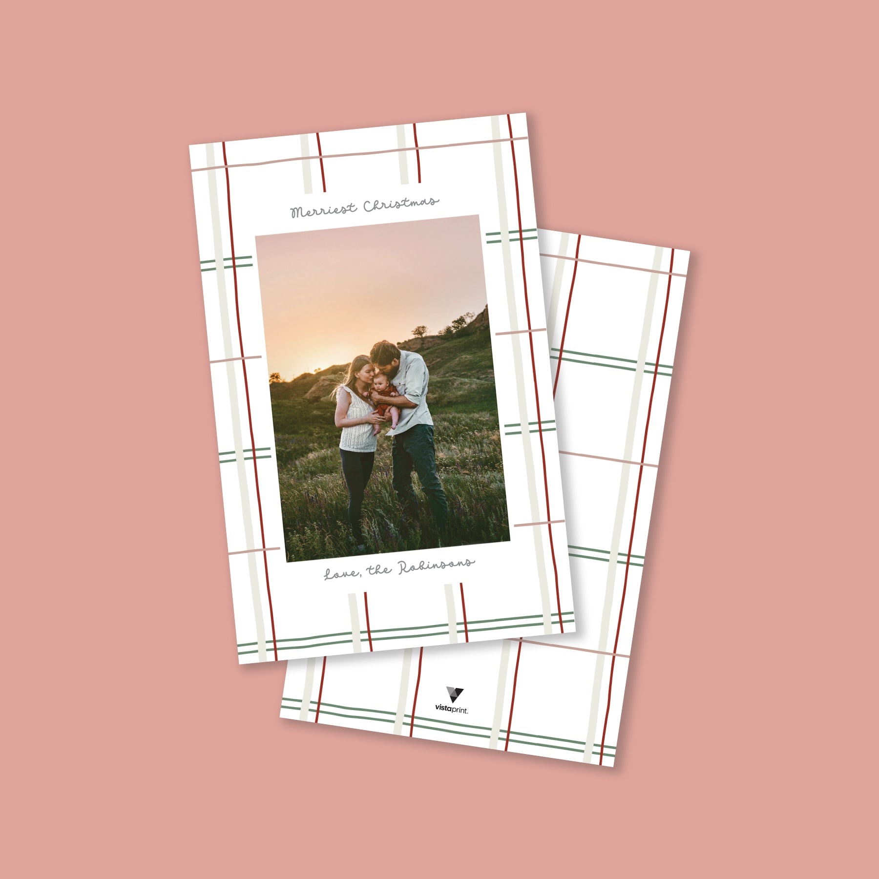
One of my favourite Christmas cards this year is this simple plaid design by Katie Upton. It’s subtly festive with muted reds and greens and a cute, fun script. This design is classic and minimal, and it really succeeds in showcasing a beautiful photo.
Joanna Alves
Associate Creative Director
Step 2: Setting the stage with trend spotting
We’re all influenced by the things we see around us. So, to create card designs that delight, it’s important to be aware of what’s on trend. At VistaPrint, we try to push the design barrier while still giving customers what they want — each year we offer traditional cards along with more experimental and trend-forward options.
What is trend research and what does it involve?
Jen: Trend research is taking a deeper look at the aesthetics of popular culture. We pull from a range of resources such as fashion, interior, surface and print design, paying attention to colours and patterns. I find lots of inspiration looking at home decor accents like rugs, cushions and wall art.
Joanna: The Product Creation & Experience Team sources Christmas trends with the help of a forecasting service. We curate themes that refer to strategic ideas that are woven into our everyday lives in 2022. We supplement these findings by looking at interior design, fine art and graphic design trends. We also study our own customer research and competitive gaps. These all combine to give us a good picture of what the festive season will look like.
What trends will we see in this year’s Christmas card collection?
Joanna: Trends that we’ve identified this year include updates to classic plaids and checks in bold bright colours, simple colour blocks and pared-back shapes, and a refined take on nostalgia with rustic influences and icons. We have also identified new approaches to classic greenery and floral themes that make these ‘evergreen’ motifs feel new (for example the block print technique is quite popular).
Does VistaPrint introduce new trends? Or is it more about delivering what customers are looking for?
Katie: Our main priority is to deliver what our customers are looking for. We are constantly exploring new ways to execute these customer favourites. We also feel it’s important to showcase new trends that might not be as popular just yet — customers can find these trends sprinkled throughout our gallery. It’s important to have a wide assortment of styles and trends to fit the needs of our diverse customer base.
STAFF FAVOURITE
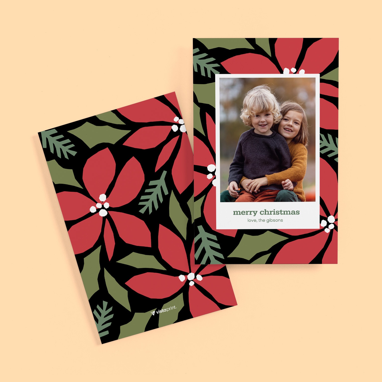
My favourite card in our Christmas collection this year is this bold, oversized florals card. This design feels festive without being too traditional/literal. The designer, Irina Shapeton, used a cut paper technique to create the shapes of the flower petals and the greenery, which gives the card a handcrafted, organic feel. The black background is a bold choice for a Christmas card and makes for a nice contrast with the cut paper artwork.
Skylar Ryan
Art Director
Step 3: The designers get to work
So, the team has gone through months of research and planning, but the story has only just begun. Now it’s time for the card collection to start coming to life.
How do the designers get inspired?
Skylar Ridabock (Art Director): A lot of the designers on the team get inspired by looking at work from other fine artists, hand letterers, designers, even children’s book illustrators. I get a lot of inspiration from interior design trends, finishes, patterns, textures, and from being out and about in the world. If I see a pattern I like on a notebook while shopping, I’ll snap a picture of it. I follow a lot of designers and hand-lettering artists on Instagram that inspire me daily, too. I also like to ask my family and friends for their opinion on my designs. My parents are both small business owners as well as VistaPrint customers, so it’s helpful to use them as a sounding board.
Jon Decelles (Art Director, Product Design): Sometimes I seek out specific inspiration that makes sense for the project I’m asked to work on, but in my own life I tend to be drawn to things I liked as a child. I love ’80s pop culture stuff and surround myself with things related to that, but I also sometimes get inspired by local artists and things like vintage or vintage modern packaging and signage.
How do the designers work?
Skylar: Every designer’s process is unique to them, but many of the designers on our team start their design process by pulling inspiration first, followed by thumbnail sketching to get an idea of how they will approach the layout of their work. Then, they bring their idea to life on the computer. Internal review and critique is an integral part of our design process. Designers are encouraged to show their work to other members of our team to get feedback through every step of the process.
Jon: This changes based on the individual designer, but I’ll usually seek inspiration from artists and designers on Pinterest and Instagram. Sometimes if I am at a store or out somewhere with my family and I see something that interests me, I’ll snap a picture with my phone and that will go into an inspiration document. From there, I’ll just kind of stir things around in my head until they start to congeal into workable ideas. I’ll also sketch stuff in a small notebook I keep on my desk, or throw together different pieces of inspiration in Adobe Photoshop or Illustrator to see if an idea will work outside my brain. After that, I’ll present concepts to my team and go through (usually) several rounds of feedback and edits until we arrive at something that will work well for our intended customer.
How personal is the design process?
Skylar: The design process is extremely personal to each individual designer. Even though there are certain aspects of the process that everyone has to go through, each member of the team has their own unique approach. Some designers hand-draw on paper and scan their work; others do everything on their iPad or computer; some folks hand-letter most of their typography; and others primarily use fonts. It’s the variance within each designer’s process that makes for such a diverse Christmas card collection.
Jen: I think the creative journey always feels personal. Our designers have a lot of passion for what they do, which makes them great artists. But they also know how to balance that with the customers’ needs.
Jennifer Nguyen (Art Director, Product Design): The design process can get very personal, especially since part of it is based on our feelings and what the card evokes. It’s hard not to be subjective because we can also be the customer we are designing for. As a designer, I feel it is my expertise to know what our customers want — part of that also speaks to my taste and what I would like. I tend to ask myself, ‘Would I buy my design if I were the customer?’
STAFF FAVOURITE
I love the simplicity and quietness of this Christmas card designed by Mary Ellen Campisi. The understated type and thin gold outline elevate the card while the unique placeholder shapes give the card a touch of personality. With the photos as the main focus, this card will be cherished by all who receive it.
Jen Movitz
Creative Manager, Product Design

Step 4: Customers get creative
The best endings are the ones you can’t predict. And an essential part of the design process for VistaPrint Christmas cards is making sure customers can finish the story their way, so they can give cards that feel truly unique and personal.
So much thought and creativity goes into each card. How do you leave room for the customer to add their personal touch?
Skylar: Making sure that each of our Christmas cards feels personal to our customer is extremely important. We always design with the customer being top of mind.
Jen: Customers can upload photos, change colours, and move many of the elements on our cards. These features ensure customers and can add their own personal touch.
Joanna: We’ve learned over the years that customers purchase from VistaPrint in order to make their Christmas cards their own. We set up our templates in the most flexible way possible so that they can completely customise. And of course, being able to add their own photo is the most important part!
STAFF FAVOURITE
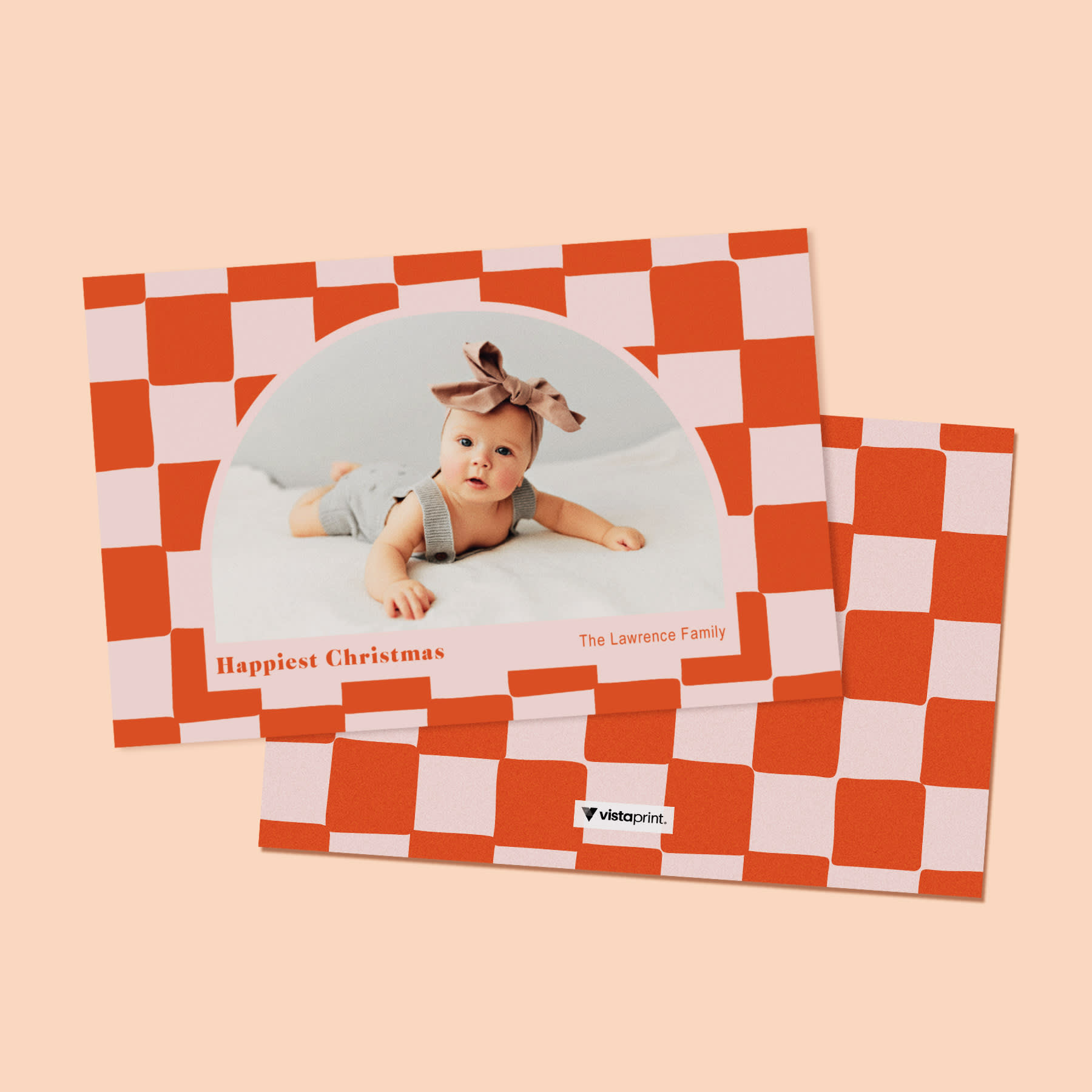
My Christmas card pick this year would be this fun, modern, retro checkerboard design. It’s an unconventional Christmas card design but it works because of the imperfect squares — it’s hand-drawn for a warm and inviting feel. Along with the colouring, it all ties that Christmas feel together. Skylar, the designer, made it extra interesting by using an arch/half-circle photo shape that makes this card super trendy and modern.
Jennifer Nguyen
Art Director, Product Design
What’s it like seeing what customers do with the designs?
Katie: It’s always so fun to see which colour options customers are drawn to and what greetings they choose to add to really make the cards their own. Always exciting to see smiling faces and cute kids as well!
Skylar: I love seeing our cards out in the world! Seeing a customer’s family photos in one of the cards I designed is really rewarding.
Joanna: It’s so gratifying seeing customers add their personal touches to our cards. Using their family photo and greeting to make it their own makes me feel like I played a small part in making their festive season special.
Jennifer: It’s fun to see what customers do with our designs. It helps us to see a different point of view and helps to improve. It’s very satisfying, though, to see that the customer utilised the card in a successful way.
STAFF FAVOURITE
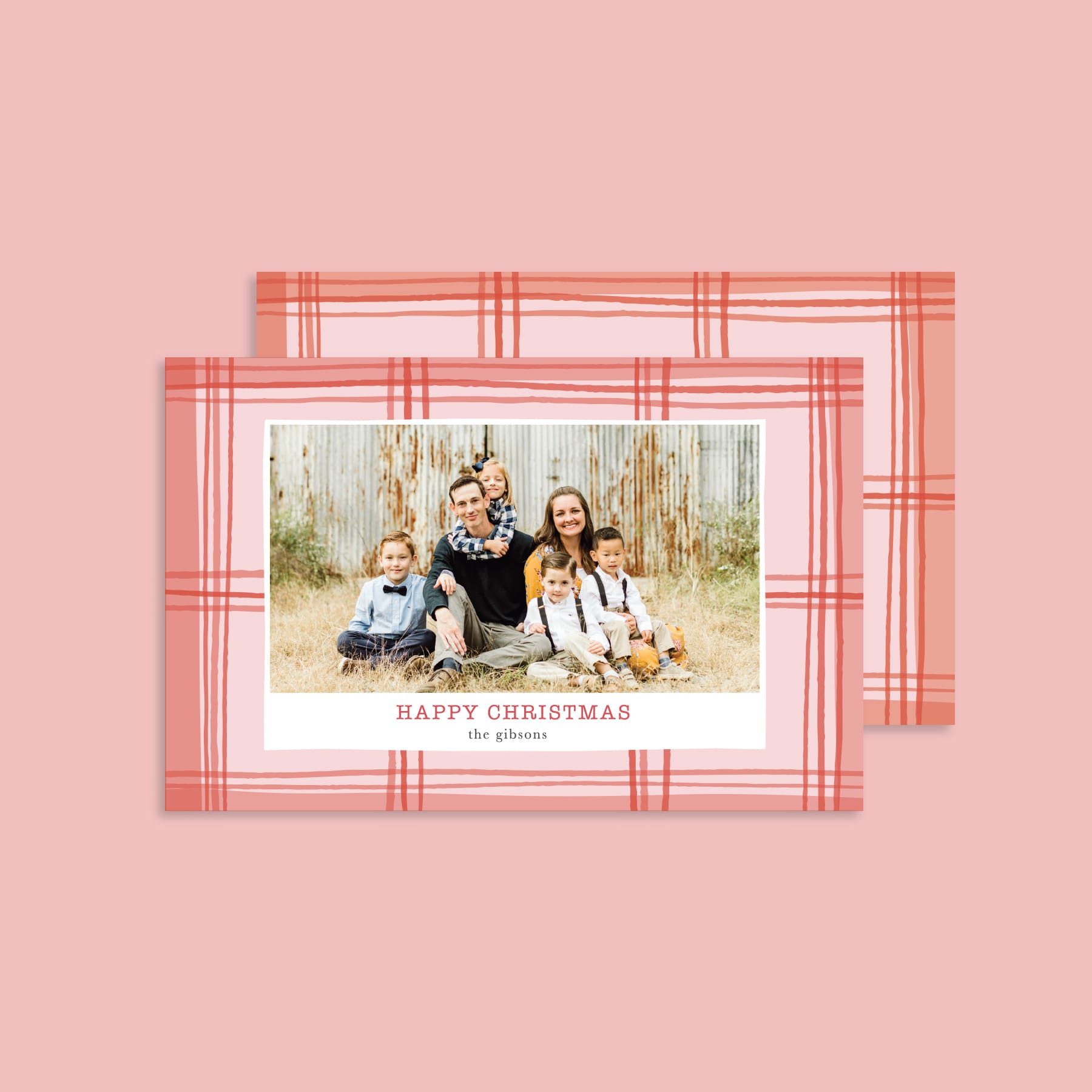
My favourite Christmas card this year is our ‘abstract plaid’ design. I love how Jennifer Nguyen (the designer) was able to modernise a very traditional Christmas pattern by using hand-drawn lines and trending colours. The card gives a current, contemporary feel while also incorporating a very classic Christmas style.
Madison Dueck
Specialist, Product Creation and Experience
What’s your favourite part of making the card collection?
Katie: I have two favourite parts! My first favourite part is doing the trend research to see how home decor or floral trends can translate to a paper card. The second is seeing how our team of talented designers interpret certain trends and ideas and turn them into unique, beautiful pieces of art.
Skylar: My favourite part about creating cards for our Christmas collection is the ability to design cards for such a broad range of design styles, trends and types of customers. No two cards in our collection look the same and it’s really interesting to see how each designer interprets a creative brief differently…and adds their own style to it.
Jen: I love the creative process. Getting inspired for Christmas during the hot summer months is challenging but really fun. Exploring typefaces, colours and patterns that will bring joy to our customers is very satisfying.
Jon: I get to think about Christmas literally all year round! I enjoy making Christmas cards because there is a little more creative flexibility…you get a little more time to create a nice illustration or little bit of artwork because with Christmas cards, the artwork is often the entire point of the product.
Jennifer: I love the research and finding inspiration and ideas when I start designing a new card. Although the best part is when everything comes together: the text, colours and layout. And the warm happy feeling the card gives you.
STAFF FAVOURITE
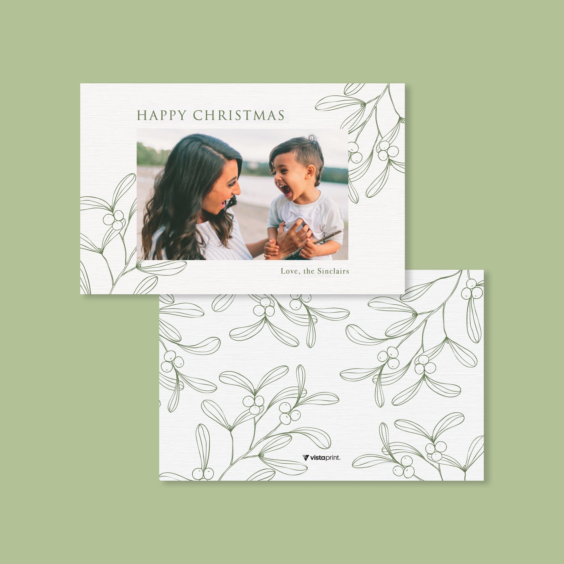
I love the minimal look of this greenery-focused card created by Irina Shapeton. It feels super on-trend by pairing a line-drawing style with a subtle texture and an earthy green tone for an organic feel. It easily resonates as a Christmas card without feeling too traditional.
Katie Raabe
Manager, Product Creation & Experience
