
Estimated reading time: 6 minutes

We chatted with Tristan LeBreton, Creative Director at 99designs by Vista, to get some tips on creating stand-out signage. Read on for Tristan’s advice and learn how to create signs, banners and posters that are attention-grabbing and easy to read.
Signage is an incredibly effective tool for delivering key messaging, grabbing your ideal customers’ attention and inspiring people to take action — whether that’s shopping your clothing shop’s big sale, attending an event at your restaurant or signing up for a monthly membership at your gym.
But not all signs are created equal — your sign’s impact will depend on how well it’s designed. If you want to design signs that make an impact on your customers — and help you hit your business goals — follow these three signage design tips.
- Contrast helps your sign design stand out.
- Hierarchy shows people what to read first…
- …and readability makes sure people understand what they’re reading.
1. Contrast helps your sign design stand out.
“Creating contrast is an effective method of ensuring people can read your sign quickly and easily”, Tristan says. “To create contrast with colour, steer away from layering complementary or similar colours, such as orange text on a red background. Instead, pair colours that are going to stand apart from one another, such as red text on a white background.”
A high-contrast design is great for readability — it ensures that your message (literally) stands out. As a rule of thumb, using a dark colour for your background and a light colour for your text (or vice versa) is the best way to create contrast in your signage design.
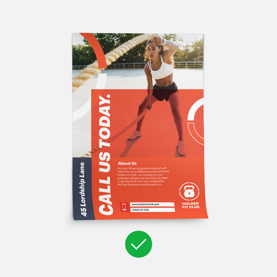
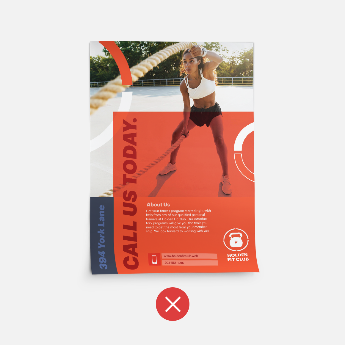
For example, if your sign design features white text against a black background, the white text will ‘pop’ against the dark background, making your message significantly easier to read. On the flip side, if your sign design has navy blue text against a black background, the text isn’t going to stand out…and your customers will have to strain to read it. And when they can’t immediately decipher what your sign says, chances are, they’re going to keep walking — and your message will get lost in the shuffle.
Some colour combinations that can work to create contrast in your signage design include:
- Black and white
- Black and yellow
- Blue/navy and white
- Green and white
You can also play around with different elements to create additional contrast and bring attention to specific parts of your sign. For example, if you’re designing a banner to advertise an upcoming sale, you might go with a dark background and light text — but add a square to the banner with a light background and dark text to call attention to a specific part of your messaging (like a 50% off discount).
Creating visual contrast by pairing light and dark colours will not only grab your customers’ attention, it will also ensure that once you have their attention, they can easily read your sign’s message.
2. Hierarchy shows people what to read first…
Your customers need to be able to read your sign. But how they read it is just as important — and that’s where hierarchy comes in.
Hierarchy is a design principle that uses size and scale to convey importance. In signage design, you want to use hierarchy to show your customers what to read first — and to highlight the most important information in your sign design.
Text size is an easy way to use visual hierarchy in your sign design. The largest text grabs your attention first — so the most important part of your message should be the largest. From there, you can use smaller font sizes to convey less important details.
Where and how you lay out the text is also important. In many languages, people read from left to right and top to bottom — so putting your largest (and most important!) text on top and working the size down from there can be an effective way to communicate the importance of each text element.
For example, let’s say you’re designing a poster to advertise your restaurant’s new lunch special. You might put the text ‘Lunch Special’ in large letters on the top of the page; then, list out the details of the special in a smaller font in the middle of the page; and then, towards the bottom of the page, share contact details for your restaurant.
Bottom line? When it comes to visual hierarchy, the larger and more prominent an element, the more likely it is to grab someone’s attention.

VistaPrint Tip
If you’re not sure how to leverage visual hierarchy in your signage design, using a template — where the hierarchy is already in place — can be super helpful! Need help getting started? VistaPrint has hundreds of signage templates to kick-start your signage design!
3. …and readability makes sure people understand what they’re reading.
As mentioned, in order for your sign to be effective, customers need to be able to read what your sign says. And while contrast and hierarchy play a large role in your customers being able to read your sign, there are other elements that play into your sign’s readability.
So what, exactly, are those elements? Some design elements that can have a major impact on your sign’s readability (and, as a result, your sign’s effectiveness) include:
- Font. There are few design elements as important as your fonts. “Your choice of fonts can make or break a sign”, Tristan says. Some fonts are more readable than others; for example, a simple sans serif font (like Arial) is going to be easier to read than a more complex script or brush font (like Pinyon Script) — particularly if your customers are looking at your sign from a distance. If you want to create the most readable sign possible, stick to more straightforward font choices — and if you do decide to go with a script or brush font, make sure to go with a bigger text size.
- Space. You might be tempted to fill every inch of your poster, banner or other type of sign with information. But trying to cram too much into your signage design can be visually overwhelming — making it harder for your customers to read. Instead, embrace space with your design. “Crowded signs are much harder to read, so don’t be afraid of ‘negative’ or ‘white’ space”, Tristan says. “Aim for thirty to forty percent of your sign’s surface to be white space to ensure important elements, such as your logo and message, stand out clearly.”
- Letter case. Using all caps can be an effective way to call attention to a specific word or phrase in your signage design. But if you overuse it, ALL CAPS CAN ACTUALLY MAKE YOUR SIGN HARDER TO READ. (See what we did there?)
- Letter height. The height of your letters will determine how easy your sign will be to read; the taller the letters, the easier your sign will be to read from a distance. This chart will give you a rough idea of the height you’ll need your letters to be based on how far away your customers will be when reading your sign:

Bottom line? “Readability is undoubtedly the most important factor of sign design”, Tristan says. “A sign is all about communicating a desired message, clearly and quickly — and all the design choices you make should be made with this in mind.”
Additional signage design ideas to help you get the most out of your sign
Need more insights into how to design the most impactful sign? Here are a few tips to keep in mind during the design process:
- Use colour to inspire action. Colour is a powerful thing. “Colours have specific psychological, emotional and cultural connotations that can influence consumer behaviour and purchasing decisions”, Tristan notes. So, if you want your signage design to be effective? Use those connotations to your advantage. For example, if you want to build anticipation for your upcoming sale, try incorporating red in your signage design, which is associated with excitement. If you want your sign to inspire trust in your customers, use blue in your design, which is associated with dependability and trustworthiness.
- Think about where your sign will be. When you’re designing your sign, it’s important to think about the end game — and let that drive your design decisions. “Understanding how and where your sign will be viewed is paramount”, Tristan says. “Will it be seen by passers-by on foot or from a car window? Will it be competing for attention in a busy shopping centre or hanging on a quiet local high street? Knowing these answers will help you choose a size, shape and design that is most appropriate and effective.”
- Use your signage to strengthen your branding. Signage is an opportunity to strengthen your brand with your customers — and it’s an opportunity you should take advantage of. “Your sign should be designed in keeping with the rest of your brand elements, such as your logo, fonts, brand colours and even tone of voice”, Tristan advises. “While you want [the sign] to stand out, you still want it to be an extension of your brand. This consistency ensures your are recognisable and instills a sense of reliability and trust with your audience.”
- Embrace creative sign design. You want your signage to grab your ideal customers’ attention — and in order to do that, you need to think outside the box with your business sign ideas. Be creative! Look for new and different ways to deliver your message and create an impactful design; the newer, fresher and more innovative your signage design, the more it’ll grab your customers’ attention — and drive results for your business.
