Estimated reading time: 8 minutes
Are you ready to take your small business brochure design up a level? After all, you pride yourself on what you do and the quality you deliver to your clients and customers. And when you create a brochure for your business, it should reflect that same level of quality. You don’t need to be a marketing expert or professional designer to create an impactful brochure — you just need a little bit of time and creativity.
In this brochure guide, we’ll take a closer look at everything you need to know about how to design a brochure that looks professional, drives results and helps get the message out about your business.
- Target the right audience.
- Write high-value copy.
- Use smart visuals.
- Choose the right fold.
- Find the right fonts.
- Consider content placement.
- Pick the perfect paper.
- Make a mock-up.
1. Target the right audience.
First things first. Before you get too far into the design process, you need to define which customers your brochure is targeting. Start by asking yourself three key questions about your audience:
- Who are they?
- What do they need from me?
- What do I want them to do?
Digging into these questions will give you the insights you need to make the right design choices for your brochure, whether it’s your font choice or fold style. Let’s go into each of these questions in a bit more depth:
Who are they? Who are the customers that you’re targeting with your brochure? Are you introducing potential customers to your work? Or maybe you’re providing additional information about a specific offering, or following up on a sales visit or trade show. Is your audience in the market for a single product or service, or are they seeking broader expertise? Defining what customers you want to reach with your brochure will ensure that your design speaks to those specific customers. And, ultimately, will help you design a more effective brochure.
What do they need from you? Once you’ve identified your target customers, it’s time to define what information you want to deliver to them…and think about what information they need from you. For example, a brand-new customer may want to know more about you, while a repeat client might want to know more about upcoming product launches or new services. Some readers need more straightforward information on prices and product features, while others want to know more about why they should work with you over the competition.
What do you want them to do? Brochures can drive a variety of results. For example, some brochures are designed to increase sales and others are geared more toward building relationships. You can’t write an effective call to action (or design your brochure in a way that emphasises that call to action) without first knowing what you’d like customers to do — whether that’s come into your retail location, place an order online or refer their friends and family members to your business. So, before you get too far into the brochure design process, make sure to define the goal for your brochure.
VistaPrint Tip
Not sure how to make a brochure, or don’t want to design it yourself? Not to worry! We’ve got plenty of brochure design templates to choose from, and with 99designs by Vista, you can even find the perfect professional designer to help bring your brochure design ideas to life.
2. Write high-value copy.
Once you’ve defined your brochure goals, it’s time to write some copy about your business. Brochure guidelines generally recommend that copy should cover three basic sections: information about your business; product and service information; and a call to action (or CTA).
Information about you and your business. Your brochure is an opportunity to share more about who you are as a business and what you’re about — so make sure to take advantage of that opportunity when thinking of brochure ideas. Share key information about your business, like your mission, values or story, or share with potential customers what makes you stand out from the competition. It’s also important to add contact details to your brochure, like your website, social media handles, phone number, email address, physical address and opening times.
Product or service information. Brochures are a great selling tool — so use them to sell your customers on the benefits of your products and services. If you provide multiple goods, products or services, split the copy up into categories to make it easier to scan and digest.
A CTA. If you want your brochure to drive a specific result, you need to tell your audience what to do with the right call to action. Write a strong CTA instructing your audience on what you’d like them to do, and then incorporate that CTA into multiple locations in your brochure. This CTA could be anything, from encouraging customers to sign up for a product demo, to encouraging them to stop by your restaurant for a meal.
Make sure to include information about how to follow through on that CTA. If you want them to come into your restaurant, make sure to include your address and opening hours. If you want them to sign up for a product demo, include a URL for the sign-up page — or add a QR code for easy registration.
As you’re writing each section of your brochure, make sure to keep the ‘cardinal rules of copy’ in mind:
- Keep the sentences short, to the point and focused on a single idea.
- Write in the first person, use ‘we’ and ‘you’ to personalise the text and never refer to your readers as ‘customers’.
- Limit your paragraphs to 3 or 4 lines so they’re easier to scan.
- Use subheadings and bullet points to separate the information and make each item more digestible.
- Less is more! While you may be tempted to share everything there is to know about your company, to avoid overwhelming readers, keep the focus on one or two key messages.
3. Use smart visuals.
Brochures generally have a lot of copy. But text isn’t the only way to make an impact! The right visuals can also help your brochure better communicate your message, build brand recognition and drive results. Some visuals you can consider incorporating into your brochure design include:
Logos. There’s no visual that’s going to help you build brand recognition with your customers quite like your logo…which is why it should be featured in every brochure design. You can also incorporate the colours and design elements from your logo into your overall brochure design to create a consistent brand look.
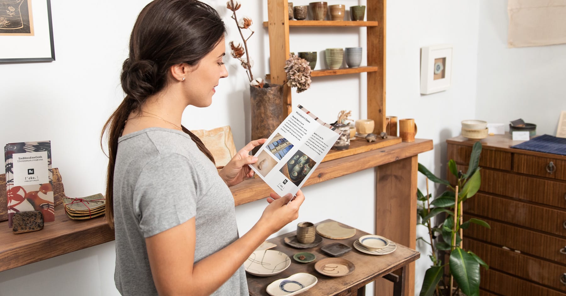
Photos. Photos can go a long way in adding visual interest to your brochure. If you can, consider hiring a professional photographer to take photos of your products, completed projects, workspace or even behind-the-scenes shots of you at work. If you decide to take your own photos, try to use a high-quality digital camera, which allows adjustments for depth of field and lighting — and generally produces better photos.
If you have photo needs that don’t require a unique image, you can purchase high-definition stock photos online. Just make sure not to use any of the same (or similar) images as your competitors!
VistaPrint Tip
If you’re on a budget or don’t have access to a digital camera, not to worry! A good smartphone can also capture fantastic images — as long as you know what you’re doing. With the right lighting and composition techniques, your phone can capture the images you need to bring your brochure design to life.
Graphics. If you decide to use graphics in your brochure design, make sure to choose easy-to-digest graphics that make a statement about your brand without going overboard. Some graphics can have an amateur, ‘looks-like-clip-art’ feel that can cheapen the overall look and feel of your brochure design, so we recommend using graphics sparingly for maximum impact.
When you’re adding visual elements to your brochure design, aim to keep things clean. You don’t want to throw so many elements on the page that your audience is visually overwhelmed and no longer knows where to look. Remember: visuals should serve your core message, not eclipse it.
4. Choose the right fold.
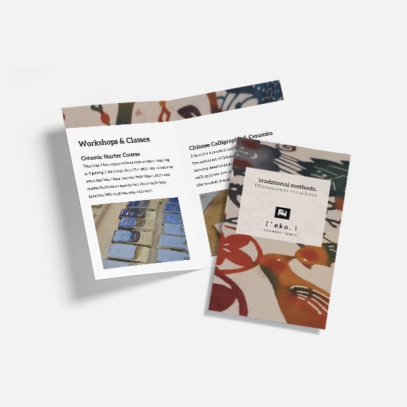
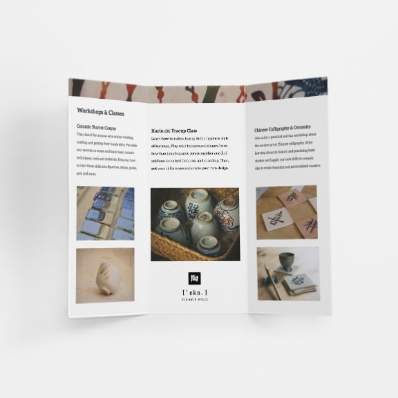
Once you’ve got your copy and visual elements figured out, it’s time to make all of these pieces work together in your final brochure design — starting with choosing the right fold type. When it comes to choosing the fold type for your brochure design, there are three main options to choose from: tri-fold brochure design, bi-fold brochure design and Z-fold brochure design.
- Bi-fold brochure design. Also known as a half-fold, a bi-fold brochure is made from a single sheet folded in half — the end result has a front cover, two sides of the brochure and a back cover. This type of brochure works well if you’re using large graphics to illustrate your benefits or you have high-quality photography that you want to highlight. Since the fold is simple, it allows the design to take centre stage.
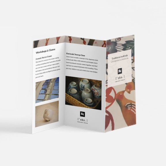
- Tri-fold brochure design. Tri-fold brochures have two distinct folds, taking each side of the sheet and folding it in towards the centre — this cuts the brochure into three separate equal panels. With more space for copy and visuals, tri-fold brochures are ideal when you have a lot of information or elements you want to include in your brochure.
- Z-fold brochure design. Z-fold brochures also have two distinct folds that create six separate sections…but unlike the tri-fold design, which folds both ends of the sheet towards the centre, Z-fold brochures fold each side of the sheet in opposite directions, creating a zig-zag shape. Z-fold brochures can be a solid pick when you want to feature larger graphs or images, or if you want your brochure to tell one large, comprehensive visual story. Because of the way they’re folded, Z-fold brochures easily fold out into one page.
5. Find the right fonts.
The next design element you’ll want to consider is your font selection. Limit your choice of fonts to two or three for consistency and clarity — any more than that can feel visually overwhelming. Choose one font for body text and another for headings. Choose fonts that are consistent with your overall branding (if you have a brand style guide, pull fonts from there — or, if you don’t have a guide, use fonts you use in other marketing materials to create a consistent look and feel).
For subheadings, use a third font or a smaller size of the second. Make sure these fonts not only work well together, but also feel like an accurate representation of your brand. For example, if you’re designing a brochure for a children’s clothing brand, using corporate fonts would feel out of place — though this font could be the perfect fit for a financial services company. If you’re including quotes or excerpts in your brochure design, you can use the same font as your heading or body text — just use italics for emphasis.
Nicholas David, an Art Director on Vista’s Product Design Team, advises using the same font family for a design, where the bold face should be used for the header and the regular face for the body copy. “Another suggestion would be to skip decorative or script fonts for body copy — focus on legibility instead.”
6. Consider content placement.
It’s also important to consider where in your brochure you want to place specific pieces of content. Covers should be low on text but high on appeal; whether it’s a logo, a slogan or a photo (or some combination of those elements), the cover image should convey your key message and get readers to unfold the brochure.
Interior panels are where most of your text will live. Just make sure to leave plenty of white space; not only will white space keep visual overwhelm at bay, but it will also make your text more readable!
The back panel should always feature your contact information and CTA. One exception is the Z-fold; on a Z-fold, the 4th panel in sequence becomes the back when folded — so keep that in mind as you’re making decisions around content placement.
7. Pick the perfect paper.
How you design your brochure is very important. But once it’s designed, what you print your brochure on is equally important! Most brochures are printed on one of four kinds of paper stock:
- Glossy
- Matte
- Uncoated
- Recycled
There’s no ‘one-size-fits-all’ solution to which type of paper stock is best for brochures — each paper type has advantages and disadvantages depending on the effect you’re going for.
Glossy paper works best if your brochure design features vibrant colours or large photographs. Just keep in mind that the high reflectivity of glossy paper can make it difficult to read under bright light, which is something to consider for more text-heavy brochures.
Matte paper is terrific if you want to keep things black and white, or employ any high-contrast colour pairing. Also, it’s worth noting that many people subconsciously consider matte paper more ‘professional’ than glossy — so if you’re trying to pull off a more corporate or professional feel, this could be a good pick.
Uncoated paper feels more natural and rustic. It’s easy to read and write on, making it a versatile choice for a variety of brochure types — especially if you want to jot down your contact information at an event.
Recycled paper has a textured finish and is made from 100% post-consumer recycled paper — a great option if your small business is prioritising sustainability.
8. Make a mock-up.
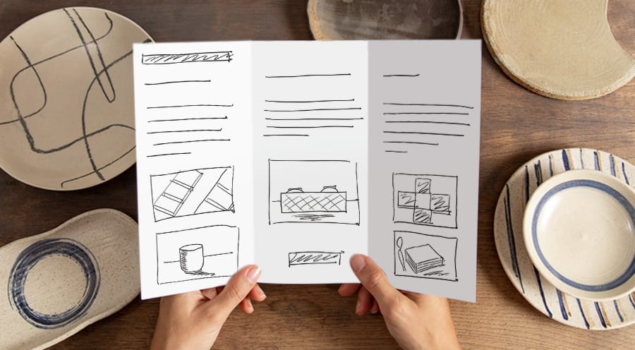
Like the old saying goes, practice makes perfect. If you’re not sure how all of your design elements are going to come together, play around with some mock-ups before you move forward with the printing process. Here are some elements you may want to practice:
Make sample folds. Take a sheet of paper and fold it into one of the common formats to see how it looks. And then, just to give yourself a few options, repeat for at least one other format (for example, a bi-fold brochure and a tri-fold brochure).
Make a template. Once you have your sample folds, sketch out the key elements that will fill each panel and see which option feels more effective or impactful.
Play around with placement. Print out your text blocks, logos and graphics and place them into your brochure template to figure out where you want each type of content to live. For example, does the balance of content to white space work? Are the essential elements easy to find? Once you’ve figured out where you want to place everything in your brochure template, glue or tape the elements in place to get a sense of what the final design might look like.
Read your finished mock-up. Once your mock-up is finished, read the brochure from cover to cover. If you’re happy with the flow of ideas and information, great! You’re ready to print. If something seems off, it’s time to go back to the drawing board.
