Estimated reading time: 7 minutes
We chatted with Megan Morahan, Creative Director for product creation at Vista, to get her insights into what makes an effective logo. Read on for Megan’s tips on choosing an identity for your small business.

As a small business owner, you appreciate the importance of standing out and making a lasting first impression. An impactful and recognisable logo helps people remember your company, but creating one from scratch or refreshing your current identity can be challenging. So, with that in mind, we’ve called in expert help to offer you some practical advice when it comes to choosing a logo for your business.
Megan Morahan has a wealth of experience helping big brands and small businesses express their values visually. And her passion for design is infectious: “I have the best job at Vista because I work with the designers who create all the beautiful template designs and business identities you see on our site.”
Here are Megan’s top tips on how to choose a logo for your business:
- Understand the purpose of your logo.
- Use a colour that makes your logo stand out.
- Get familiar with different types of logos.
- Balance your design elements.
- Make your logo versatile.
- Get help from an expert.
1. Understand the purpose of your logo.
Your logo acts as a visual representation of what your company does and helps existing and potential customers recognise your business.
An effective small business logo design:
Symbolises your business values.
Increases credibility in the eyes of potential customers.
Serves as a visual keepsake for customers.
If you’re starting a business, don’t worry about what your startup logo looks like just yet. Instead, ask yourself what you want people to feel when they first encounter your company. Consider the words they would use to describe using your products or services. These words are the essence of your business.
Then, you can associate those words or feelings with a look and feel. Think of this initial brainstorm as the foundation you’ll build your logo around. It’s important to create a list of business attributes to give you a clear communication goal.
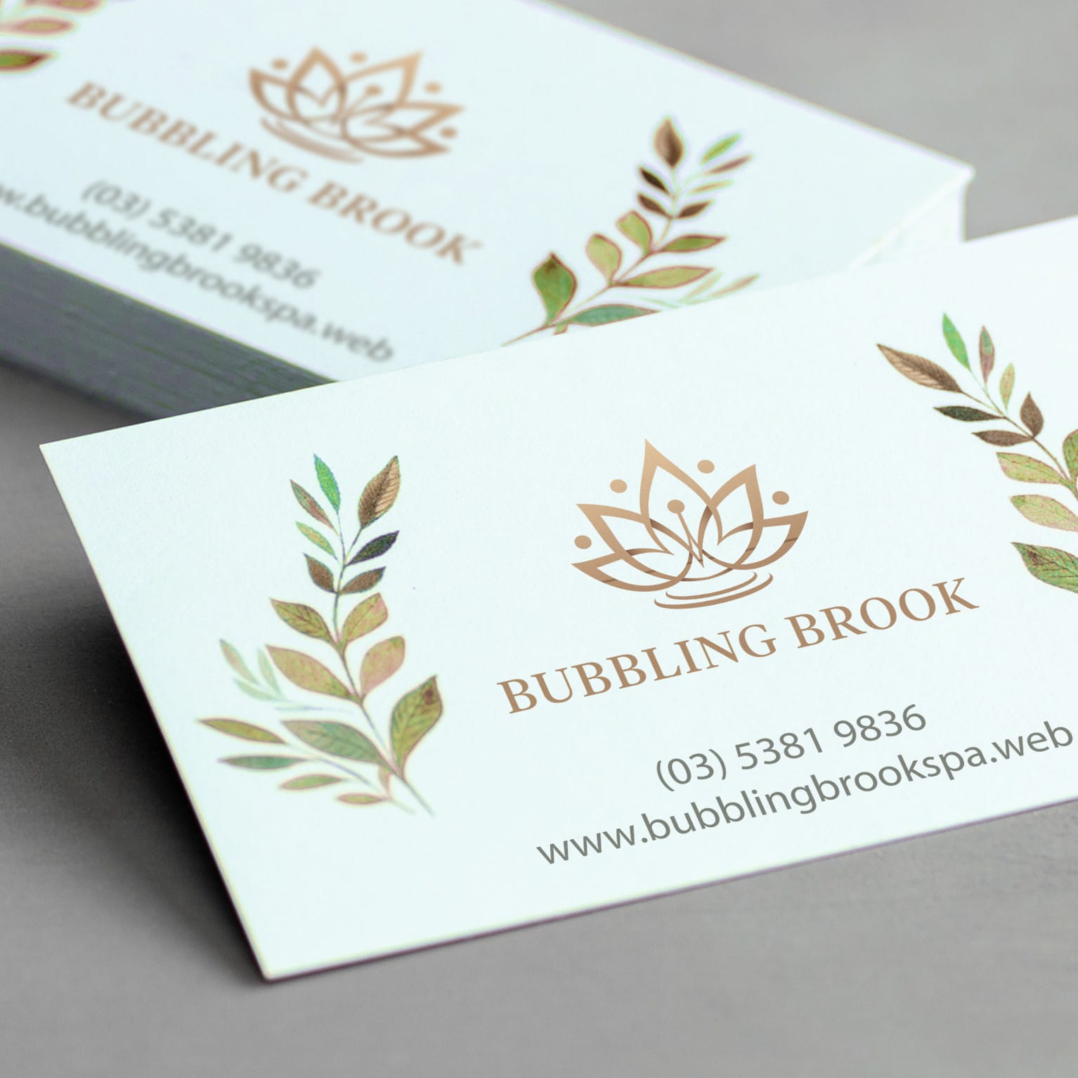
Let’s use a spa as an example. You go to a spa to relax and rejuvenate. These associations need to come through visually so that people get a sense of how they’ll feel relaxing at the spa just by looking at your logo. Think of some of the words associated with a spa — maybe even close your eyes and imagine you’re there, kicking back and relaxing. What words best sum up your daydream: Calmness? Tranquility? Peace?

Clean and simple design elements and text treatments would best represent those attributes. The lotus flower is a popular symbol for spas for its cultural associations with purity, beauty and rebirth. It could be coupled with a simple serif font to convey that sense of calm.
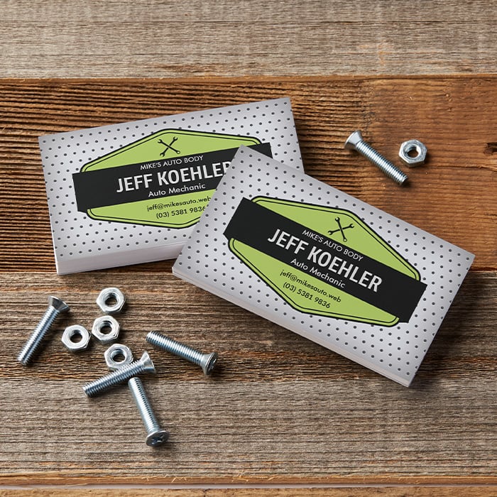
On the other hand, if you’re a mechanic, you might want to communicate that you’re practical, hardworking and reliable. How would you visualise these qualities? You might opt for something vintage and rustic that includes the tools of your trade, like a spanner or an oil can. These visual clues both communicate that you’re not afraid to get your hands dirty fixing cars. They’re also easy to recognise and associate with a service.

2. Use a colour that makes your logo stand out.
The subject of typical emotional associations with colours is fascinating, especially seeing how they differ between cultures. A lot of our customers use black and blue, which is probably due to seeing so many established corporations using these colours — and for good reason! Black is often used as an expression of strength, sophistication, tradition and trust. Blue is typically associated with competence, trust, dependability and security.
Go back to the attributes you’ve noted down and think about how you want your customers to feel when they see your logo. Think about what you want your logo to say and how colour associations will affect your message. Then, consider the type of logo that best suits your business.
If you would describe your style as bold and colourful, those attributes should come across in your logo. If your business style is more mellow and understated, you can use more subtle shades. Look at other businesses with a similar style to get a feel for what works. What colours do they employ to communicate those attributes?
3. Get familiar with different types of logos.
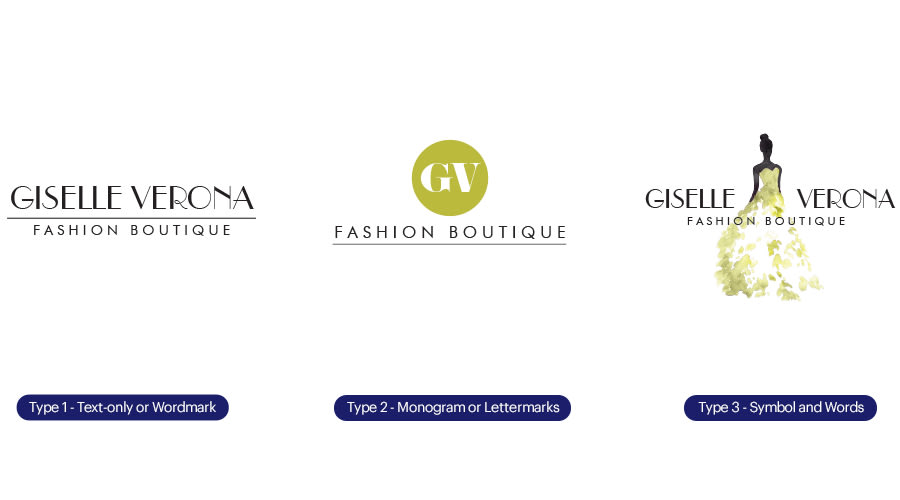
There are three basic types of logos — check them all out and decide which one is best for your business.
- The first is a text-only or wordmark identity, which is ideal if your business has an established reputation or uses a family name.
- The second type of logo consists of a monogram or lettermark, which uses the first letters of the company name in a visual way. This combination provides both a visual representation of your company and a verbal recognition of your name.
- The third logo type combines a symbol with words. The logo is often made up of a shape that acts as a visual clue to the service or product you offer. This serves as the central part of your logo, which when coupled with a company name creates a recognisable and enduring look.

4. Balance your design elements.
Once you have figured out the essence of your business, you need to start thinking about how to balance that vibe with the style of your logo. “For example,” Megan says, “if your company is quirky and fun, you can try fresh, unique fonts paired with dynamic colours and symbols. Or, if your company is more traditional, you could balance your logo by using a classic font and a more conventional colour palette.”
And like so many things in life, Megan recommends that, when in doubt, keep things simple. “Clean, open spaces will instantly make your logo look professional…and ensure it’s easy to recognise.”
One of Meghan’s favourite perfectly balanced logos is the World Wildlife Fund logo. “It’s recognisable and has been around for ages, but doesn’t feel outdated at all. It’s one of those classic logos we all recognise. I love the smart way the white space wraps around the panda to convey a sense of protection.”
Another of her favourites is Bully Boy Distillers. “It’s a Boston liquor company with a fascinating family story. What I like about their logo is that it’s also bold and recognisable — just like their name. It’s one colour and employs an imposing horse icon. Their labels couple elegant typography with a solid silhouette to achieve an established look, despite the brand being relatively new. This example demonstrates how the right font selection can elevate an icon.”
5. Make your logo versatile.
Knowing where people see and interact with your logo is crucially important. If you own a cafe, you probably want your logo to go on your T-shirts as well as the menus, flyers, website and your social profiles. It’s also likely to be included on your signage, so it needs to work in a variety of sizes.
If you work onsite as a landscaper, plumber or builder, you may want to advertise when you’re on the go — maybe by adding your logo to the side of your vehicle with a car door magnet or vinyl decal. So, make sure all text is clear and easy to read, even from a distance! Be sure to test the legibility of your logo from various distances.
6. Get help from an expert.
If you don’t feel confident designing your own logo and have a limited marketing budget, you’re not alone. The good news is, there are several options available to help you design a business logo.
If you just need something simple that communicates your area of business and contact details, browse the designs in our galleries. There are thousands of business card designs to choose from covering most sectors and styles with a range of matching products. The logos you see in the business card gallery can feature across your complete marketing toolkit.
If you want something unique or more customised, check out Vista’s Logomaker for plenty of personalised business logo ideas. Or, find a 99designs by Vista designer to work one-on-one with you.