Estimated reading time: 4 minutes
When establishing your small business as a welcoming operation, it’s important to recognise how accessible signage plays a key role. Take the time to prioritise inclusivity. That way, you can cultivate both a positive environment and positive interactions with your business.
Whether in your brick-and-mortar location or out in the community, you want your signage to clearly tell prospective customers who you are, what you do and what you offer. And with thoughtfulness, empathy and some splashes of creativity, you can accomplish just that. It’s time to demonstrate you’re a business that supports the needs of any potential customer.
The importance of accessible signage
For inspiration on how to ensure signage is accessible, we’re going to refer to the U.S. Access Board’s specific guidelines for signage, which comply with the Americans with Disabilities Act (ADA), the federal legislation that prohibits discrimination based on disability in the United States. The Access Board’s work helps to ensure that everyone in the country can navigate buildings safely and effectively. For decades, ADA signage has empowered those with accessibility needs, such as the visually impaired and those using wheeled mobility aids, to feel welcomed and valued at restaurants, entertainment venues, fitness centres, retail stores and more.
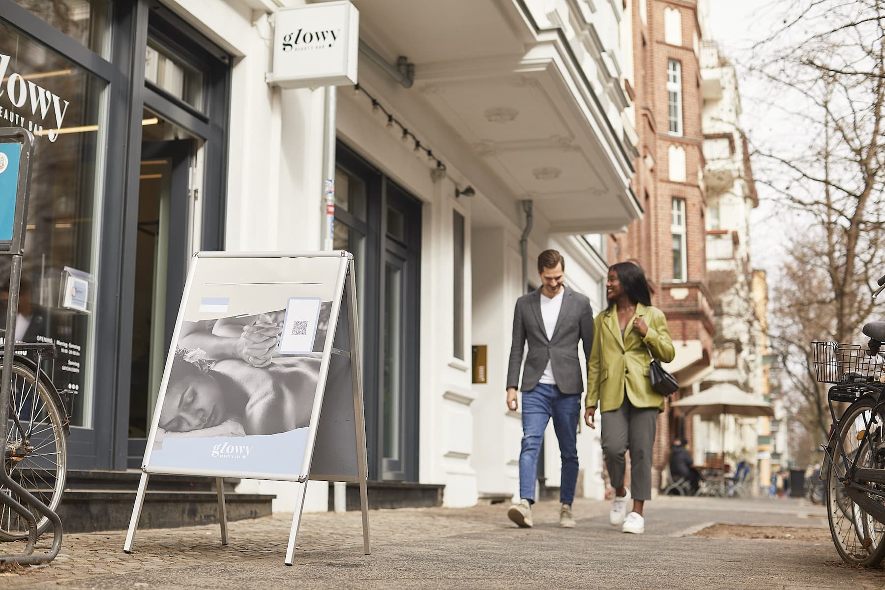
The Access Board’s guidelines, however, generally apply to signage for permanent spaces, such as room numbers, toilet or parking signs, as well as wayfinding signage, such as directional arrows, stairwell indicators or exit signs. Temporary signs like vinyl banners announcing an upcoming move to a new location, window posters detailing a special event or A-frame pavement signs announcing a sale would be exempt from these regulations.
However, businesses should still make sure they’re sending the right message to all of their prospective customers. Designing your small business signage with inclusivity in mind enables you to identify your business as a welcoming, responsive operation that respects its customers. More inclusive signage can also boost your brand’s visibility and generate community goodwill.

5 tips for making your signage accessible
Even if your marketing signage doesn’t have to adhere to anything official like the ADA rules, you can still take cues from their guidance to design signage that is as vibrant and informative as it is accessible and inclusive. Here’s how:
1. Choose your colours wisely.
ADA guidelines suggest using contrasting colours, such as white on black or yellow on navy. Apply this same logic to your signs to ensure readability. When selecting colours for text, choose colours on opposite sides of the colour wheel from your background colour so the content stands out, while still staying true to your core brand colours.
2. Favour legibility with your font.
The ADA signage guidelines spell out rather specific rules for text, requiring sans serif fonts and uppercase letters, for instance. Although your signage might not need to be so precise, the general principle of selecting clean, intelligible fonts is still something to keep in mind. You can browse a seemingly endless array of fun, whimsical fonts, but avoid choosing anything too ornate or eccentric. A crisp, straightforward font will be the most readable.
3. Give your text breathing room.
According to the ADA, ‘Character spacing, as measured between the two closest points of adjacent characters excluding word spaces, must be 10% to 35% of the character height’. You may not want to get that numerically detailed, but you certainly need to consider appropriate spacing. Give some breathing room between letters as well as words and borders, and be selective with the copy and imagery you include so content does not blend together. When it comes to clean, accessible signage, space is an ally.
4. Say it in a picture.

As the saying goes, ‘a picture is worth a thousand words’. That is why the ADA requires the use of established symbols to indicate important locations like stairwells and toilets. The visual offers immediate clarity. Similarly, signage with imagery can say something about your business, its mission and its values. Showing a photo of a wheelchaired customer getting their nails done at your nail bar or dining at your restaurant shows your business caters to its customers and makes the necessary accommodations to ensure a satisfying experience. Conversely, don’t forget about visually impaired customers and the importance of including braille signs around your business, too.
5. Get rid of glare.
ADA rules call for non-glare finishes, which minimise the impact of sunlight or artificial light on readability. A glossy finish on signage can reflect light and make reading a struggle. A matte finish will not change based on light, which makes it more consistently readable. When possible, choose a matte finish for your banners and posters.
Design your signage with accessibility in mind
Although you may not have to follow ADA guidelines when designing your temporary marketing signage, these rather prescriptive rules can help you create clean, clutter-free signage with key information on sales, events and special offers. Essentially, it emboldens, enriches and enhances your communication with customers.
Design your signage with accessibility and inclusivity in mind and follow some basic ADA-inspired signage principles, such as the use of contrasting colours, legible text and imagery. By doing so, you can create effective signage that demonstrates you are invested in your customers and committed to providing them a welcoming, friendly experience.